By the end of this install, the numbers you check obsessively — pipeline, cash, sales, open tickets, whatever your five are — live in one artifact. You open it, say "refresh," and the current picture renders in seconds: headline figures, movement since last week, reds sorted to the top. No more opening five tabs and a spreadsheet to answer "how are we doing?" before your first meeting.
This is your first Track 2 install: the Business OS runs on real company data, which means it runs best on Lane B. There's a Lane A version below — deliberately more manual, still better than the five tabs.
Prerequisites
- Install 0 (The Kernel) — the Lane Decision matters more here than anywhere so far.
- Lane B strongly preferred: a company Claude Team/Enterprise workspace with connectors to your data sources (CRM, Drive/SharePoint, finance sheets), enabled by your admin. On Lane A, use the manual variant in step 3.
- Your obsession numbers — the three to seven figures you actually check daily. Not what the board asks for; what you look at.
- The dashboard spec template (download below).
Build steps
-
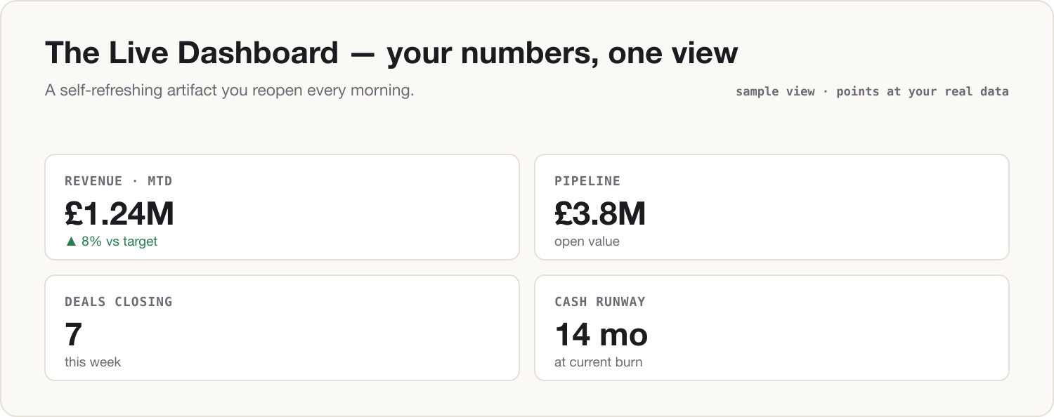
Fill in the spec. Open the dashboard spec template and complete one row per number: the metric, where the true value lives, what it's compared against (last week, target, same period last year), and the thresholds that make it green, amber, or red. Don't skip thresholds — a dashboard without them is a data dump you still have to interpret.
-
Pressure-test the spec before building. Paste:
Here is the specification for a one-screen dashboard of the numbers I check
every day. Challenge it before we build:

- Which of these are vanity metrics that move without meaning anything?
- Given my role ([e.g. commercial director, 40-person business unit]), which
  number am I NOT tracking that I should be?
- For each metric, which comparison is most honest: vs last week, vs target,
  or vs the same period last year?

Recommend a final list of no more than seven numbers, with one line of
reasoning each.

--- SPEC ---
[paste your completed dashboard spec]
Take the two minutes. The most common dashboard failure isn't technical — it's tracking seven numbers where two matter.
-
Build the artifact. On Lane B, with connectors on for this chat:
Build an interactive dashboard artifact from the final spec. Layout rules:

- One screen, no scrolling on a laptop.
- Each metric: headline number, small delta vs its comparison, and a
  green/amber/red status from my thresholds.
- Reds and ambers sort to the top.
- A "last refreshed" timestamp in the corner.

Pull the current values from [your connected sources — e.g. the CRM
connector and the finance sheet in Drive]. If a value is unavailable, show
it greyed out rather than inventing it.
On Lane A, same layout, pasted figures:
Build an interactive dashboard artifact from the figures below, using the same layout rules: one screen, headline number + delta + green/amber/red status per metric, reds sorted to the top, "last updated" date shown. These figures are rounded and anonymized. I will paste a fresh set each week — keep the layout identical between refreshes so changes are easy to see. --- THIS WEEK'S FIGURES --- [metric — current value — previous value, one per line] -
Make it a place, not a chat. Create a Project called "Dashboard," move the chat into it, and put your spec in the project instructions. From now on the refresh ritual is: open the project, type one line —
Refresh the dashboard. Re-pull the current values from the same sources,
keep the layout identical, and flag anything that changed status since
the last refresh.
On Lane A, the same line, plus this week's pasted figures underneath.
-
Optional — put it on the clock. If Install 2's morning brief is running, extend its scheduled instruction: "Also refresh my dashboard project and include any metrics that changed status in the brief." Now status changes reach you before you've asked.
The Two-Lane note
Lane A (personal Claude): never connect company data sources to a personal account — no exceptions, however convenient the connector looks. Your dashboard runs on a weekly manual paste of rounded, anonymized figures ("Region A," "~£400k"), per the Firewall rules from Install 0.5. That's a weekly-refreshed dashboard, not a live one — and the gap you feel every time you retype the numbers is the point. It is the exact distance between your workaround and the Lane B version, and it's the first line of the case you'll make in Install 9.
Lane B (company Claude Team/Enterprise): contractual no-training, admin-approved connectors, so the dashboard reads real values from real sources on every refresh. Keep connector access read-only and least-privilege — the dashboard only ever reads. Once it's stable for a week, share the project: your team gets the same picture, and "how are we doing?" stops being a meeting.
Component shipped
You now have a live dashboard: your obsession numbers in one self-refreshing view, thresholds doing the interpreting for you. Tomorrow morning: open the Dashboard project, type "refresh," and read the reds before anyone's asked you anything.